Android美工坊--selector选择器的使用
selector选择器可以让你切换自定义的背景风格,比如button、ListView、或者布局点击时候的背景切换等,都需要用到它
背景可以是自定义到颜色,或者图片资源
首先需要在你的res目录下创建drawable文件夹,然后在里面创建一个selector文件,如myselector.xml
注:不知为什么,selector里面有关focus的东西在真机上没什么效果,反而会影响使用,比如android:state_focus="true",加上它就没有效果,去掉它就可以正常使用了
默认情况下直接用下面的布局即可实现点击后即可切换背景,其实只需要两个item标签即可,当然,item标签内部可以用shape标签自定义不同的风格
例子1:button点击效果
res/drawable/myselector.xml
<?xml version="1.0" encoding="utf-8"?>
<selector xmlns:android="http://schemas.android.com/apk/res/android" >
<item
android:state_pressed="true"
android:drawable="@drawable/button_pressed"
></item>
<item
android:drawable="@drawable/button_normal"
></item>
</selector>
res/layout/main.xml
<?xml version="1.0" encoding="utf-8"?>
<LinearLayout xmlns:android="http://schemas.android.com/apk/res/android"
android:layout_width="fill_parent"
android:layout_height="fill_parent"
android:orientation="vertical" >
<Button
android:id="@+id/test"
android:layout_width="fill_parent"
android:layout_height="wrap_content"
android:background="@drawable/myselectr"
android:text="Go Home"
/>
</LinearLayout>
运行效果:
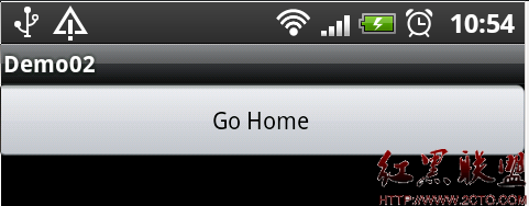 这是正常情况
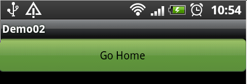 这是点击后的效果
当然,针对button的selector还有很多其他的配置,但是对于一般程序来说上面的配置就够了
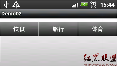
例子2:TextView点击效果
这个例子是网上找的,演示的是一个用TextView来定义的一个Button,实现类似TabWidget风格的选项卡。
自定义按钮,这里没有通过Button类或者子类去做派生,而是通过TextView派生出来的。
在这里三个按钮是三个TextView派生类实例,中间的白线,是1px宽的白色矩形,这样就可以做出类似上面的效果。先看图
点击后

/res/drawable/background_color.xml 用shape标签自定义一个渐变背景
<?xml version="1.0" encoding="utf-8"?>
<shape xmlns:android="http://schemas.android.com/apk/res/android" >
<gradient
android:startColor="#FFFFFFFF"
android:endColor="#FFFFFFFF"
android:angle="270.0"
android:centerY="0.3"
android:centerColor="#FFBDBDBD"
/>
</shape>
/res/drawable/button_color.xml
<?xml version="1.0" encoding="utf-8"?>
<shape xmlns:android="http://schemas.android.com/apk/res/android" >
<gradient
android:startColor="#FF7F7F7F"
android:endColor="#FF000000"
android:angle="270.0"
/>
</shape>
<?xml version="1.0" encoding="utf-8"?>
<selector xmlns:android="http://schemas.android.com/apk/res/android"
android:constantSize="true">
<!-- 获得焦点时的背景图片 -->
<item android:state_focused="true">
<shape>
<gradient
android:startColor="#FFE5CF33"
android:endColor="#FFF1E7A2"
android:angle="90.0"
/>
</shape>
</item>
<!-- 设置相应所有事件 -->
<item android:state_enabled="true" android:state_pressed="false">
<shape>
<gradient
android:startColor="#FF1B1B1B"
android:endColor="#FF969696"
android:angle="90.0"
/>
</shape>
</item>
<!-- 按钮点击时的背景 -->
<item android:state_enabled="true" android:state_pressed="true">
<shape>
<gradient
android:startColor="#FF000000"
android:endColor="#FF474747"
android:angle="90.0"
/>
</shape>
</item>
<item android:state_enabled="false" android:state_pressed="true">
<shape>
<gradient
android:startColor="#FF000000"
android:endCol
补充:移动开发 , Android ,