纯CSS实现Lavalamp效应的花式菜单效果
下面我们将使用纯css实现滑动菜单效果, 使用 css3 转换和重新创建一般同级连结符选择器。下面我们将讨论三个简单的例子。
第一步:写在前面的
我们使用了一个叫unicaone的google web字体,在“星形和箭头”示例中我们使用了下面的图片组合
第二步:html
三个例子的每个 html 是相同的。我们将只是切换名为ph-line-nav的class到ph-dot-nav和ph-heart-nav.
[html]
<div class="nav ph-line-nav">
<a href="#">Home</a>
<a href="#">About</a>
<a href="#">Gallery</a>
<a href="#">Contact</a>
<div class="effect"></div>
</div>
第三步:所有例子的共同CSS
下面是三个示例的共同css,需要强调的是div.nav的position是relative,<a>是float:left;
下面是省略了前缀的css
[css]
.nav {
overflow: hidden;
position: relative;
width: 480px; }
.nav a {
display: block;
position: relative;
float: left;
padding: 1em 0 2em;
width: 25%;
text-decoration: none;
color: #393939;
transition: .7s; }
.nav a:hover {
color: #c6342e; }
关键的部分lavalamp-like效应发生在这里:
[css]
.effect {
position: absolute;
left: -12.5%;
transition: 0.7s ease-in-out; }
.nav a:nth-child(1):hover ~ .effect {
left: 12.5%; /* the middle of the first <a> */}
.nav a:nth-child(2):hover ~ .effect {
left: 37.5%; /* the middle of the second <a> */ }
.nav a:nth-child(3):hover ~ .effect {
left: 62.5%; /* the middle of the third <a> */}
.nav a:nth-child(4):hover ~ .effect {
left: 87.5%; /* the middle of the forth <a> */}
当鼠标移动到a元素上时div.effect就移动到它的中间。在这里我们需要了解transition-timing-function(在这里),这里我们使用ease-in-out函数。
第四步:深入细节1
让我们从最简单的示例开始,就是demo中第一个一条滑动的线的效果。
你只需要定义线的尺寸和颜色和垂直的位置。
[css]
.ph-line-nav .effect {
width: 90px;
height: 2px;
bottom: 36px;
background: #c6342e;
box-shadow: 0 1px 0 white;
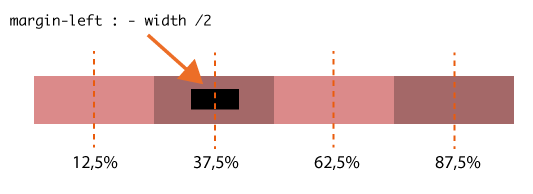
margin-left:-45px;
}
在每个情况下,我们将设置左边距为元素的一半长度,它总是在链接居中悬停,请参阅下面的图像:
第五步:深入细节2
现在,让我们讨论一下带点效果。使用“:after”我们将 1px 的水平高度线添加到 div.nav。我们还使用“:after”添加了小点点,定位在每个菜单项下面的一行上。Div.effect 现在是一个 10px 的圆,其属性类似于前面的示例中的那些。
[css]
.ph-dot-nav:after {
content: "";
display: block;
position: absolute;
width: 100%;
height: 1px;
background: #c6342e;
bottom: 40px; }
.ph-dot-nav a:after {
content: "";
position: absolute;
width: 4px;
height: 4px;
bottom: 38px;
left: 50%;
margin-left: -2px;
background: #c6342e;
border-radius: 100%; }
.ph-dot-nav .effect {
width: 10px;
height: 10px;
bottom: 36px;
margin-left: -5px;
background: #c6342e;
border-radius: 100%; }
第六步:深入细节3
最后,让我们看一看”心和箭“的示例。”心“由两个元素组成”:before“(心的左半部分) 和”:after“,”after“的z-index设置为1所以星形在箭头之上,这样就形成了一个穿过心的效果:
[css]
.ph-heart-nav .effect, .ph-heart-nav a:after, .ph-heart-nav a:before {
background: url('../images/heart.png') no-repeat; }
.ph-heart-nav .effect {
position: absolute;
bottom: 26px;
background-position: 0 0;
height: 8px;
width: 62px;
margin-left:-31px; }
.ph-heart-nav a:before, .ph-heart-nav a:after {
content: "";
display: block;
position: absolute;
left: 50%;
bottom: 20px;
background-position: -62px 0;
height: 20px;
width: 11px;
margin-left: -11px; }
.ph-heart-nav a:after {
z-index: 1;
background-position: -73px 0; }
补充:web前端 , HTML/CSS ,