iOS应用开发新手教程:iOS5 UIKit新特性
现在有了ios5了,UIKit添加了许多控件元素的外观。

开始前的准备
我已经创建好了一个简单的应用,这样大家就可以把重点放在学习如何定制UIKit界面元素上。
当你打开项目之后,先看看其中的代码和XIB文件。你会发现主视图呈现了一个冲浪之旅的列表,而细节视图则匀速我们获取每个冲浪之旅的详细信息。
看完基本代码和XIB文件后,让我们编译运行项目,会看到以下的两个视图。
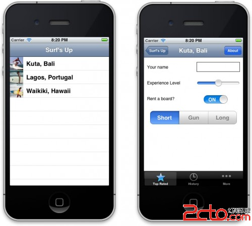
现在我们要做的事情是,把这个完全标准的界面改造成具有独风格的定制界面。
添加背景图片
事实上,我们已经把所需要的资源图片都放在Resources里面了,所以要做的只是添加代码而已。
在images文件夹中有一个bg_sand.png图片。我们打算用它当做细节视图的背景图片。
打开DetailViewController.m,创建一个viewDidLoad方法如下:
-(void)viewDidLoad{
[superviewDidLoad];
[[selfview]setBackgroundColor:[UIColorcolorWithPatternImage:[UIImageimageNamed:@"bg_sand"]]];
}
无疑,这是设置背景图片的最佳方式,虽然没有backgroundImage这样的属性,但是使用backgroundColor属性我们同样可以实现这个目的!
编译运行项目,可以看到以下界面:

定制UINavigationBar
在images文件夹中,我们将使用以下两个图片来定制导航栏:surf_gradient_textured_32.png和surf_gradident_textured_44.png。
我们希望在导航栏中从左到右重复铺设这些图片。之所有用了两个不同的高度,是因为当导航栏切换到横屏模式时会缩小。
要实现以上效果,iOS提供了两个新的API:
1.UINavigationbar现在可以设置backgroundImage属性
2.UIImage提供了新的resizableImageWithCapInsets方法,方便创建可调整大小的图片。
当然,我们可以进入细节视图,并使用以上API来直接设置导航栏的背景图片。但如果这样做,那就得在列表视图或应用的其它视图中手动修改。
幸运的是,iOS5允许我们一次性定制用户界面元素,从而让“处于同一级别的”界面元素使用类似的定制。
在SurfsUpAppDelegate.m文件中,在application:didFinishLaunchingWithOptions:方法的上面添加一个新的方法如下:
-(void)customizeAppearance{
//create resizable images创建可调整大小的图像
UIImage *gradientImage44 = [[UIImageimageNamed:@"surf_gradient_textured_44"]
resizableImageWithCapInsets:UIEdgeInsetsMake(0, 0, 0, 0)];
UIImage *gradientImage32 = [[UIImageimageNamed:@"surf_gradient_textured_32"] resizableImageWithCapInsets:UIEdgeInsetsMake(0, 0, 0, 0)];
//set the background image for *all* UINavigationBars为所有导航栏设置背景图片
[[UINavigationBarappearance]setBackgroundImage:gradientImage44forBarMetrics:UIBarMetricsDefault];
[[UINavigationBarappearance]setBackgroundImage:gradientImage32forBarMetrics:UIBarMetricsLandscapePhone];
//customize the title text for *all* UINavigationBars为所有导航栏设置标题文本
[[UINavigationBarappearance]setTitleTextAttributes:
[NSDictionarydictionaryWithObjectsAndKeys:
[UIColorcolorWithRed:255.0/255.0green:255.0/255.0blue:255.0/255.0alpha:1.0],
UITextAttributeTextColor,
[UIColorcolorWithRed:0.0green:0.0blue:0.0alpha:0.8],
UITextAttributeTextShadowColor,
[NSValuevalueWithUIOffset:UIOffsetMake(0, -1)],
UITextAttributeTextShadowOffset,
[UIFontfontWithName:@"Arial-Bold"size:0.0],
UITextAttributeFont,
nil]];
}
在以上的代码中,头两行的作用是使用resizableImageWithCapInsets方法创建了可伸缩的图像。需要注意的是,该方法取代了之前版本中使用的stretchableImageWithLeftCapWidth:topCapHeight:方法(已被删除)。
关于cap insets,我们只需简单的设置指定图像在顶部,左端,右端和下部的固定区域。在这里,我们希望整个图片都伸缩,所以为每个端都设置了0。
接下来的两行代码使用appearance(外观)代理将可伸缩图片设置为背景图片,并指定了导航栏的测量方式。
最后几行代码指定了细节视图中的标题样式。我们传入了标题文本属性词典,相关的可用键值包括:
UITextAttributeFont
UITextAttributeTextColor
UITextAttributeTextShadowColor
UITextAttributeTextShadowOffset
Ok,差不多搞定了,只需要在application:didFinishLaunchingWithOptions:方法的顶部添加一行代码:
[selfcustomizeAppearance];
编译运行应用,并切换设备的朝向,可以看到以下画面:

定制UIBarButtonItem
打开images,找到button_textured_24.png和button_textured_30.png两个文件,我们将用它们来设置导航栏中的按钮外观。
注意我们需要将按钮图像设置为可调整大小的,因为按钮的宽度取决于其中的文本。
对于这些按钮,我们不需要最左和最右的5个像素也伸缩,所以需要将left和right cap insets设置为5。
在customizeAppearance方法的最后添加以下代码:
//customize the apperance for UIBarButtonItems
UIImage *button30 = [[UIImageimageNamed:@"button_textured_30"] r
esizableImageWithCapInsets:UIEdgeInsetsMake(0, 5, 0, 5)];
UIImage *button24 = [[UIImageimageNamed:@"button_textured_24"] resizableImageWithCapInsets:UIEdgeInsetsMake(0, 5, 0, 5)];
[[UIBarButtonItemappearance] setBackgroundImage:button30forState:UIControlStateNormalbarMetrics:UIBarMetricsDefault];
[[UIBarButtonItemappearance] setBackgroundImage:button24forState:UIControlStateNormalbarMetrics:UIBarMetricsLandscapePhone];
[[UIBarButtonItemappearance]setTitleTextAttributes:
[NSDictionarydictionaryWithObjectsAndKeys:
[UIColorcolorWithRed:220.0/255.0green:104.0/255.0blue:1.0/255.0alpha:1.0],
UITextAttributeTextColor,
[UIColorcolorWithRed:1.0green:1.0blue:1.0alpha:1.0],
UITextAttributeTextShadowColor,
[NSValuevalueWithUIOffset:UIOffsetMake(0, 1)],
UITextAttributeTextShadowOffset,
[UIFontfontWithName:@"AmericanTypewriter"size:0.0],
UITextAttributeFont,
nil]
forState:UIControlStateNormal];
以上代码其实和定制导航栏的差不多。首先我们还是为按钮创建了可伸缩的图像,并设置为背景图片。然后我们指定了文本的格式。
其中的”back”按钮需要特殊定制,因为它需要看起来与众不同。
让我们在customizeApperance方法的最后添加以下代码来特殊对待back按钮:
//customize the appeance for "back" on UIBarButtonItems
UIImage *buttonBack30 = [[UIImageimageNamed:@"button_back_textured_30"]
resizableImageWithCapInsets:UIEdgeInsetsMake(0, 13, 0, 5)];
UIImage *buttonBack24 = [[UIImageimageNamed:@"button_back_textured_24"]
resizableImageWithCapInsets:UIEdgeInsetsMake(0, 12, 0, 5)];
[[UIBarButtonItemappearance]setBackButtonBackgroundImage:buttonBack30forState:
UIControlStateNormalbarMetrics:UIBarMetricsDefault];
[[UIBarButtonItemappearance]setBackButtonBackgroundImage:buttonBack24forState:
UIControlStateNormalbarMetrics:UIBarMetricsLandscapePhone];
需要注意的是,我们为back按钮设置了不同的cap inset值。同时,UIBarButtonItem还有一个专门的backButtonBackgroundImage属性可以使用。
编译运行,可以看到下图:

定制UITabBar
在iOS5中提供了一个API来设置UITabBar的背景图片,以及表示选中的图片。
在customizeAppearance方法的底部添加以下代码:
//customize the apperance for UITabBar
UIImage *tabBackground = [[UIImageimageNamed:@"tab_bg"]
resizableImageWithCapInsets:UIEdgeInsetsMake(0, 0, 0, 0)];
[[UITabBarappearance]setBackgroundImage:tabBackground];
[[UITabBarappearance]setSelectionIndicatorImage:
[UIImageimageNamed:@"tab_select_indicator"]];
我想这三行代码基本不需要再解释了。
编译运行项目,会看到以下界面:
定制UISlider
在iOS5中,我们只需设置maximusTrackImage,minimumTrackImage和thumbImage属性即可轻松定制滑动控制。
让我们在customizeAppearance方法的底部添加以下代码:
//customize the apperance for UISlider
UIImage *minImage = [[UIImageimageNamed:@"slider_minimum"]
resizableImageWithCapInsets:UIEdgeInsetsMake(0, 5, 0, 0)];
UIImage *maxImage = [[UI
补充:移动开发 , IOS ,